 PREVIOUS ARTICLE
Something I’ve learned over the years: The hardest thing to do is make something look easy. Yet somehow the New York Times Magazine manages to do that with their covers. Every week I’m blown away by how beautiful and smart they are. Curious about how they do it, we spoke to three women who played a key role in some of the best covers — design director Gail Bichler, associate photo editor Stacey Baker and prop stylist Randi Brookman Harris. Here’s what they told us…
Gail Bichler has been the design director of the New York Times Magazine since 2014: “Cover ideas can be really challenging to come up with. We’ll say, ‘Oh, it’s so hard.’ We kind of say that every time. The fast pace is daunting. The good thing about covers happening every week is that sometimes you hit it and sometimes you don’t, and that’s just part of making that much stuff. As long as you have the high highs, it’s okay. The ones that really succeed are those that make people think, ‘Oh, of course that’s the cover!’ ”
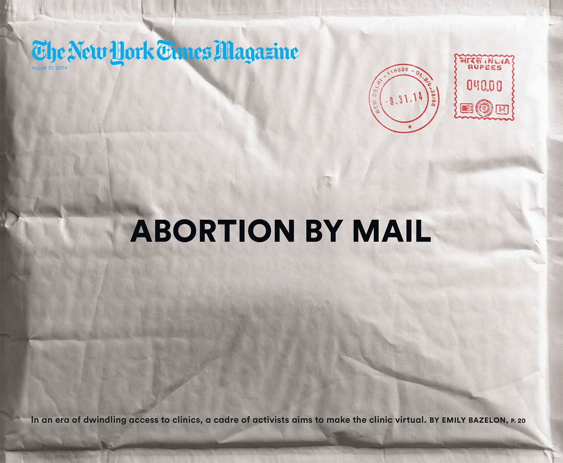
“The story was about women providing abortions to other women in places where abortion was illegal — by sending pills through the mail. We wanted the magazine to feel like an object, so when you looked at it, you almost felt like you were getting the package. We put pills in the package so it would feel dimensional. It was a very deliberate choice to have the ‘New York Times Magazine’ not be part of the envelope — by making the logo blue not black, and putting a crinkle in the paper under it so you can see that it’s definitely not ON the envelope. We wanted to make it clear that it’s not the New York Times that’s mailing you the pills! It’s funny how much these nuances matter. The details make or break the execution.” — Gail Bichler, design director of the New York Times Magazine
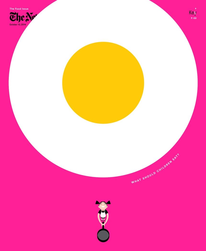
“This cover, illustrated by Christoph Niemann, was graphic, playful and had a sense of joy. I love that the egg bleeds off the top. It helps you understand the perspective that you’re above this little girl, and seeing the egg fly up to you. We were also experimenting with the idea that we’re a magazine wrapped in a newspaper, so we don’t have to sell on the newsstand — that means we can do things that other magazines might shy away from, like aggressively covering up our logo.” — Gail Bichler
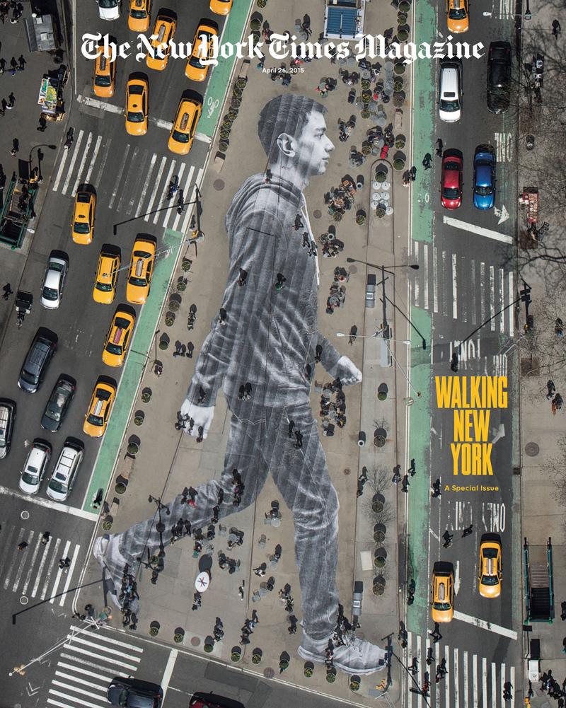
“I would say a typical cover is anywhere between three and 10 days. It’s really fast. But there are outliers — for example, we did a cover with the artist JR that was a month-long collaboration. The idea was complicated to execute and was a huge effort on the part of our photo team. We scouted a location and got permits to use the space; we did casting for the person JR was going to photograph, and then he did the shoot, made an image and pasted it down on the Flatiron plaza. After we put the cover out, someone tweeted something like ‘New York Times, have you ever heard of Photoshop?’ [laughs]” — Gail Bichler
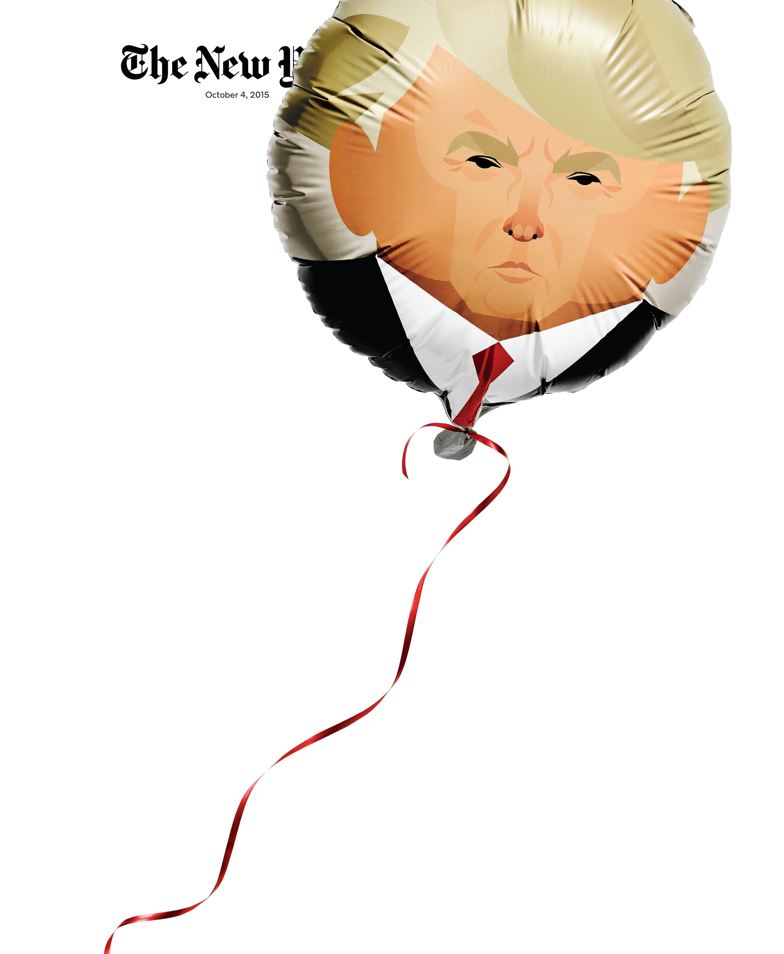
“When the magazine first called me, they said, ‘We want Trump’s face on a balloon.’ It took me days to figure out how I could even do that. The only place that prints custom four-color mylar balloons had a 10,000 unit minimum and it would take six weeks just to get a proof. After 45 phone calls, you go down a rabbit hole, calling every single balloon expert and asking, ‘Is there ANY POSSIBLE WAY to print this illustration on a balloon?’ I was sweating. Everyone said, ‘Nope.’
“Then one lady said she could do it, but only in black and white. The shoot was happening in less than a week. With revisions and shipping she would have to make the balloon in a day. She kept saying no to color, but somehow I got under her skin and she took pity on me. I was thinking, ‘It’s for the cover of the New York Times Magazine! I can’t fail at this!’ She came into her office early on a Saturday morning and sent me an email saying she figured it out. I was dancing in my apartment.
“She sent 40 balloons in case of a popping emergency. For ribbon, I brought 14 different colors and types. We decided on a loose-hanging ribbon. A straight ribbon felt too confident, like a puffed out chest, like ‘OHHH!’ But with a loose ribbon, it felt open to interpretation. The best covers have some ambiguity — this cover could be showing Trump rising or that he’s full of hot air, deflating.” — Randi Brookman Harris, prop stylist
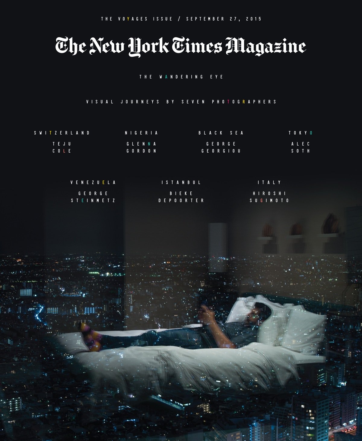
“Voyages is our closest thing to a travel issue. We went to photographers and asked where they’d like to go in the world. Photographer Alec Soth decided on Tokyo. He was a big fan of the movie Lost in Translation, so he wanted to go to the Park Hyatt hotel and not leave for five days. He searched on Craigslist and other resources and found locals he wanted to bring into the hotel to photograph.
“The cover image is Alec lying on his hotel bed on his iPhone. When Kathy Ryan [director of photography] and I saw it, we both thought, ‘That’s one for the ages.’ It’s so layered — strong compositionally, but also the idea that here’s Alec in his bedroom floating above Tokyo and lying there on his iPhone. That’s kind of the way we all travel. A great cover is one that is ‘poster like,’ as Kathy says — it’s iconic but also graphic. We ended up fading the background a little so it goes more to black and using type to have almost stars twinkling above him.” — Stacey Baker, associate photo editor at The New York Times Magazine
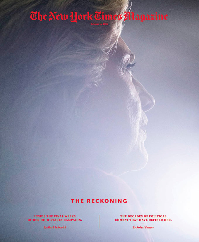
“A few weeks ago, we had a cover story on Hillary Clinton. We very much wanted a sitting with Clinton to take her portrait, but her team couldn’t grant one. We asked Benjamin Lowy, a phenomenal photojournalist, to cover her campaign events with the sole goal of getting a cover-worthy picture of her. The stakes were high for him, and there wasn’t much that I as a photo editor could do. He was filing pictures every day. He was going in tight. The light at these events is not easy; you can’t flash, you can’t strobe because that would be distracting for her. But he solved all these problems. The cover was phenomenal, and the opening image of the article looks like a sitting with her.” — Stacey Baker
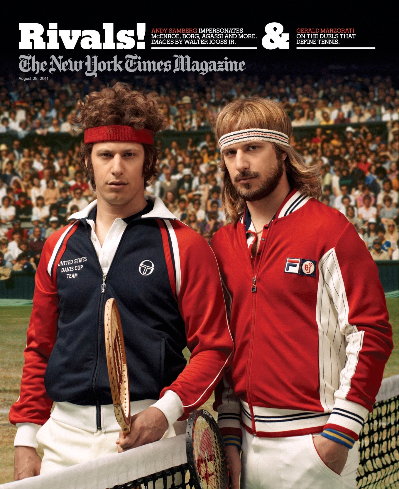
“The cover story was about the U.S. Open. We originally had the idea of doing a spoof, where the cast of Saturday Night Live would dress up as famous tennis players. It didn’t work out, largely because of their crazy schedules. What DID work out is that Andy Samberg was game, so we had him dress up as five champions: Andre Agassi, Pete Sampras, Jimmy Connors, John McEnroe and Bjorn Borg. The other thing that was such a privilege was that we worked with the hair and makeup team from SNL. They’re used to working at such a fast pace at SNL, and they very quickly transformed him into these characters. We brought in the Sports Illustrated photographer Walter Iooss, who had photographed all these tennis players over the years in a journalistic fashion. I did all the photo research, and we photographed him on a green screen, and we worked with a picture house to collage the pictures so it looked like the original pictures from the 1980s. For the cover, we spoofed the old photo of McEnroe and Borg. When you saw that cover on that Sunday morning, a smile immediately came to your face. Comedy can be hard to pull off, but I think it was really successful.” — Stacey Baker
How fascinating, right? When things get extra tough, design director Gail Bichler says: “Sometimes I think, well, we’re going to publish SOMETHING. There WILL be a cover. You have to learn to live with that pressure.” What amazing women!
P.S. Behind the scenes with Girls’ costume designer and an Ob-Gyn.
