
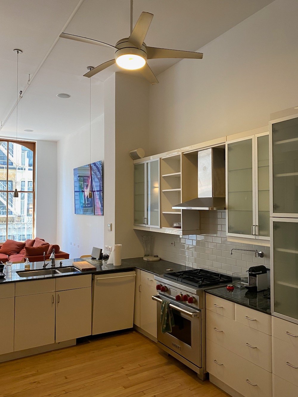
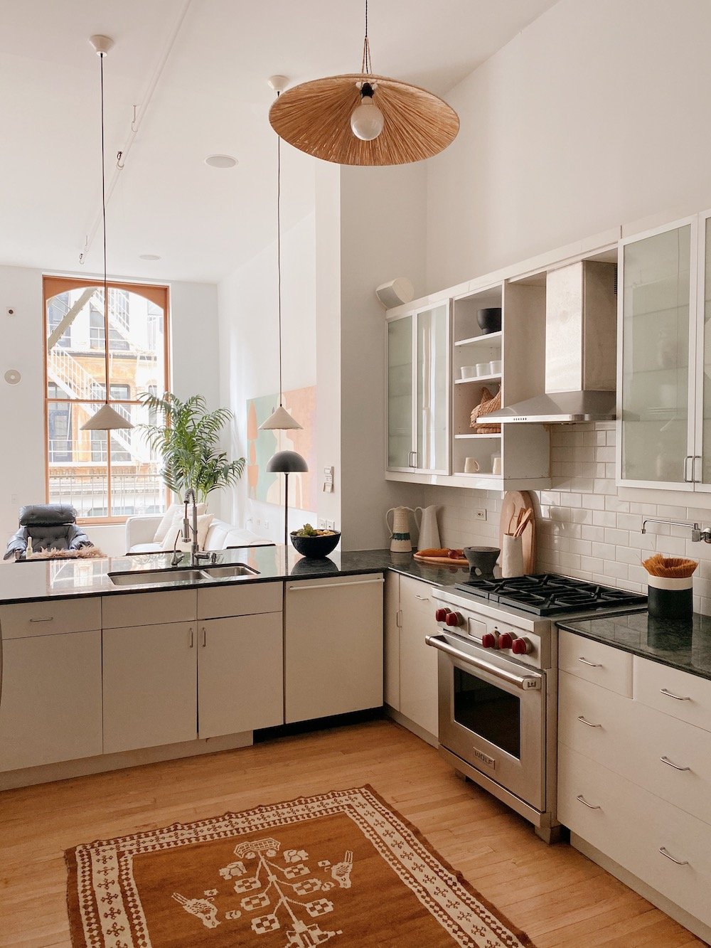
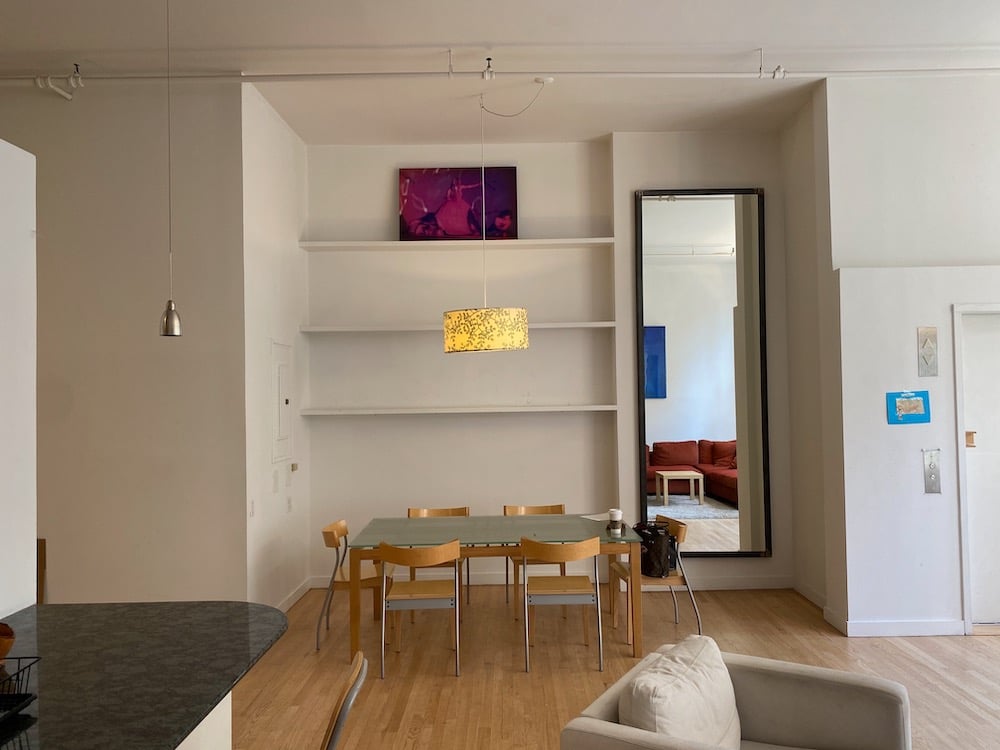
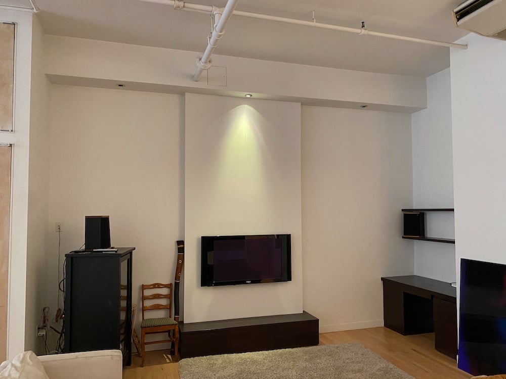
Sisters Hollister and Porter Hovey live and work together. They run a firm — Hovey Design — that stages homes for real estate. (Basically, they take apartments with great bones and redesign them to look their best.) Here, the sisters reveal the before and after of a Soho apartment…
Balance the furniture’s proportions. Most city apartments have rectangle living rooms, so sectionals can feel visually unbalanced. Instead, consider a sofa and a couple comfy chairs. That’s also a good conversation set-up when you have people over.
Hang art lower in living rooms. Artwork should be about eight inches over your sofa so you can see it while you’re sitting. You don’t want to crane your neck to see the art — that gives you a sense of unease. (For a hallway, you can hang things at a higher level because it’s more like walking through an art gallery.) Also, we went super big with the artwork here, since we had a lot of bigger furniture. If we’d gone littler, the art wouldn’t have felt as impactful.
Try making your own art. We’re big on DIY and demystifying art. You could even just paint a canvas a solid color and hang it over your sofa and it will look cool.
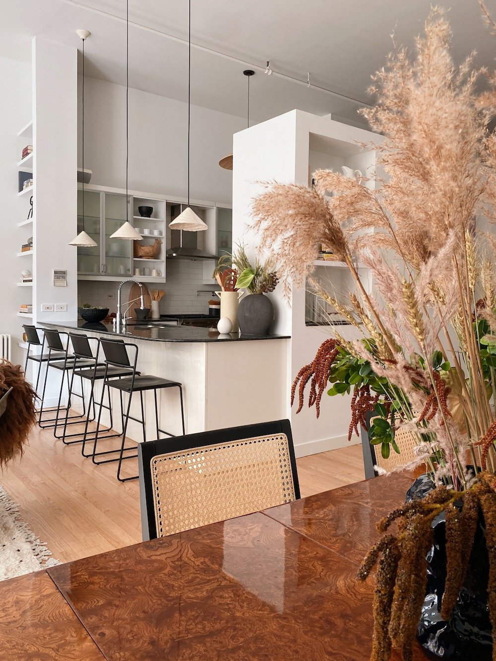
Mix materials. The kitchen has an industrial feel, so we added ceramic lighting to make it feel softer and more organic. It’s great to contrast between soft lines and hard lines. Etsy is such a good source for lighting — we especially love the store baradaXceramics.
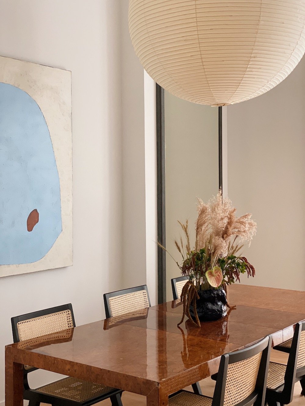
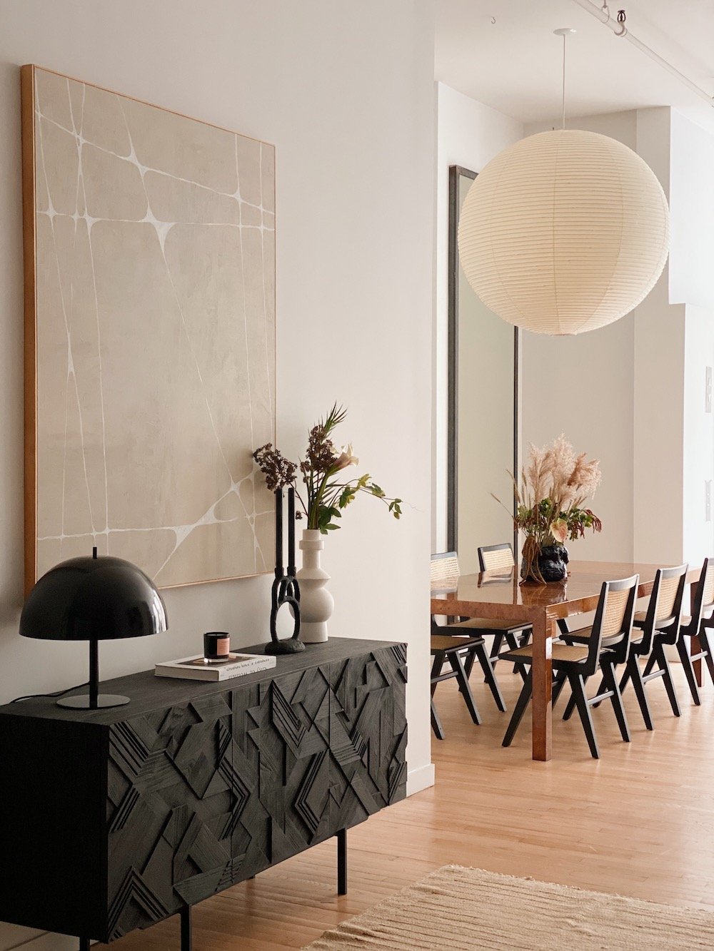
Lean into drama! This apartment is super dramatic with huge windows, so this space craved a bigger table. We also went with the Noguchi ball lamp to create more drama. Adding the art brought in color and made a big difference. We also got rid of the shelves, which were too high.
Go for neutral furniture. If furniture is super neutral and classic, then you can always change things up by swapping out artwork or a flower vase.
Switch up shapes. Here, you have square chairs and rectangular table and a rectangular mirror contrasting nicely with the big pendant ball.
Don’t ignore a hallway. People often neglect hallways, but it’s a great opportunity for a fun experience. Any time you have a hallway, if it’s wide enough, go for a skinny table and artwork.
Consider painting the walls. Another tip — although we didn’t do it here — is to paint the hallway a dramatic dark color. It will hide the scuffs, and a dark moody hallway makes walking into the brighter room feel like a breath of fresh air. They do this in hotels and it’s a neat experience.
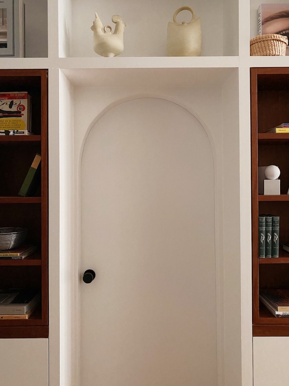
Switch out the doorknobs. If you’re moving into a home that has lots of different colors of metal, change all your doorknobs to black. Here, switching out the clunky doorknobs made it feel cohesive. Black is a good neutralizer.
Let light pour in. In the before photo, the curtains cut off half the window. But even if you had ceiling-to-floor curtains, they’re still going to be jammed against the wall. For these windows, we’d go with a shade.
Consider a workhorse mirror. We use the round Umbra mirror all the time. It’s great and affordable, especially for its size.
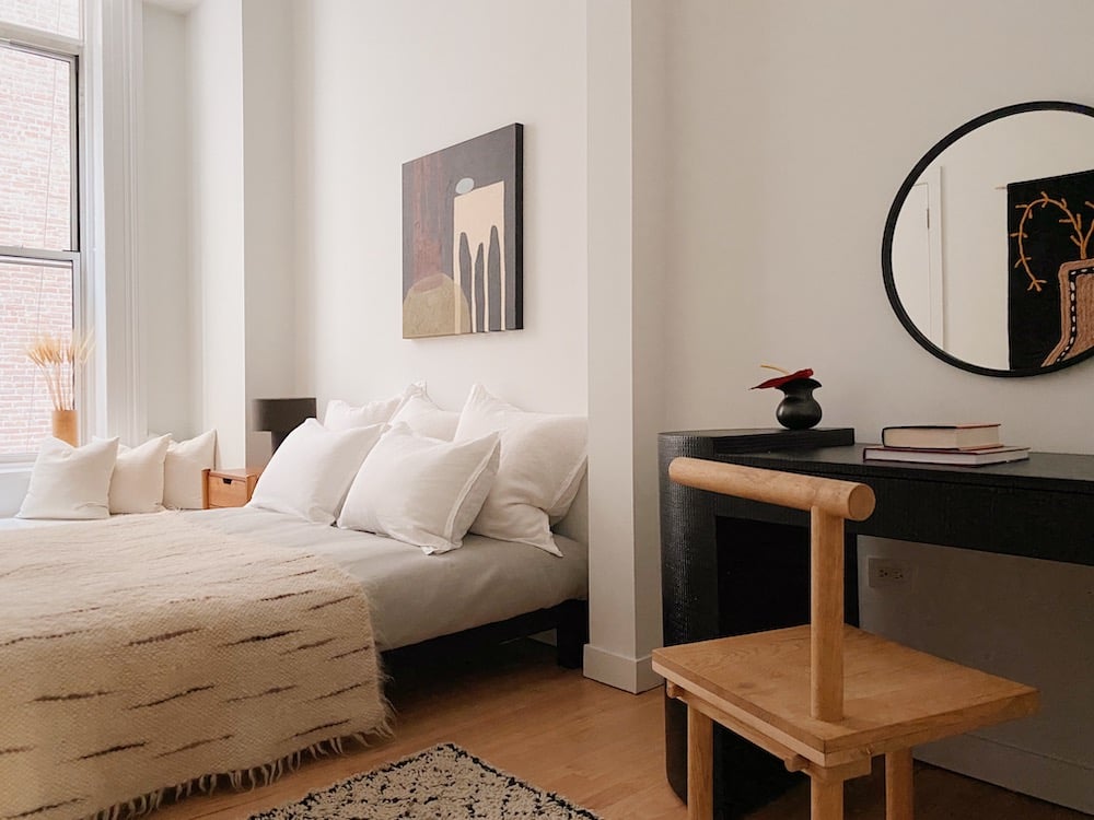
Squeeze in a corner desk, if you can. These days, many people are working from home, so we added a desk. (In our staging projects, people used to request nurseries and now they want home offices.) Also, it’s so funny how adding more furniture makes a place look bigger — it’s counterintuitive!
Thank you so much, Hollister and Porter!
P.S. All our house tours — including the sisters’ own apartment tour and a one-bedroom apartment they staged.
(Photos by Hovey Design; listing from Tracie Golding.)
 PREVIOUS ARTICLE










 81 COMMENTS